
Classic American Diners: Collectible Postcards and Matchcovers (Schiffer Book)
R**N
Nostalgic nosh
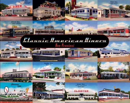
A rich selection of diner postcards and matchbooks though it must be said one diner postcard is not too different from another but when you see more than 270 all in one go they become quite fascinating. The rest of the 450 pictures in the book are matchbooks. All the material is from Don Preziosi's collection but he left out colour glossy photographic postcards. I agree with his reason: these cards, though obviously an exact record of what a diner looked like yet they lack the exuberant color and period feel of the illustrative diner postcard.There is an interesting few pages near the front of the book that covers postcards and matches from diner makers. The O'Mahony, Silk City, Kullman, Paramount, Fodero, Manno and DeLuxe get a look in with black and white photographic postcards though they have a retouched look to put the best gloss on the units. The matchbooks use illustrations. The diner makers didn't miss a trick by going for a streamline look, suggesting modernity and cleanliness, so many of these diners use the curves, glass bricks and lightweight metals associated with streamline design.There is a nice feature on page 132: four cards and a matchbook for the Ideal/New Diner on Route 40, Aberdeen, Maryland. Preziosi writes a bit about the background to the changes to this diner over the years. There are also a few cards where owners used the Dinor rather than Diner spelling.Wonderful though all these postcards are I was disappointed with the book's production. There are so many pages with two or three items that just don't fill the space even though they are angled and frequently a bit of one overlaps another. I suppose the problem was having a book of too many pages for too little material. To break up the editorial flow of white pages a few use blown-up card images as a background with the proper cards printed on top of the picture but even here crude white oblongs are arbitrarily cut into the background for the short captions. The imprint, contents, acknowledgements, intro and the few text pages are uniformly dull with unimaginative typography. The author's text uses a large size type to help fill out as many pages as possible. The one concession to a contemporary look is a nice drop shadow on all the illustrations.The front cover, with twenty postcards, all the same size and butted together looks stunning but how frustrating to see these lovely period graphics wasted on the inside pages because of poor editorial design. For what the reader gets I think the book really is overpriced.
A**T
si c'est parfait, attention quand même
ce sont exclusivement des documents d'époque, cartes postales et boites d'allumettes.Donc ça a sérieusement vieilli car les document datent souvent d'avant guerre ou juste après.Il faut aimer l'histoire, il faut aimer le kitch: si c'est le cas, ça vous enchanteraTrès peu de texte (en anglais)
Trustpilot
4 days ago
1 day ago
